Exploring the capabilities of data visualization, particularly through the integration of Power BI and Business Central, is an exciting prospect for many users. They are eager to leverage the connection between these two platforms to generate dynamic reports that extend the data from Business Central. As a personal passion and the cornerstone of my career, I spend a lot of time delving into this area. Today, I’d like to highlight a specific visual that I believe can significantly improve data visualization within the scope of Business Central warehousing and bin management.
The Synoptic Panel by OKVIZ is an intuitive visual available for download in the Power BI Visual Marketplace. It allows the display of one or more images, referred to as “maps,” which do not have to be geographic in nature. These maps consist of defined areas, each associated with specific data that determines their meaning. These areas can be dynamically highlighted or colored, and various data points can be overlaid on them. You can design these maps using a vector graphic editor or through their dedicated tool, Synoptic Designer. This is a free to use, user-friendly visual that can give your report another dimension.
In the rest of this post, we will examine a use case that utilizes Cronus USA data from Business Central, connect it to Power BI, and employ the Synoptic Panel Visualization.

Use Case
Background:
Cronus USA is a prominent department store chain specializing in coffee, groceries, furniture, and household goods. The store utilizes Microsoft Dynamics 365 Business Central to manage its extensive inventory across multiple locations.
Business Requirement:
Cronus USA seeks to enhance its inventory management and sales analysis by integrating Business Central with Power BI. The primary objective is to create an interactive map that allows the management team to visually manage inventory levels and analyze how the placement of products within the stores impacts sales performance. This map should enable slicing of data by item category code to facilitate detailed analysis.
Objective:
Develop a dynamic, interactive map within Power BI using the Synoptic Panel by OKVIZ, leveraging data from Business Central to:
- Display inventory levels of various product categories (coffee, groceries, furniture, household goods) across store.
- Analyze sales data to determine if the physical placement of products affects sales figures.
- Enable data slicing by item category code for targeted analysis and decision-making.
Data Integration:
- Extract relevant inventory and sales data from Business Central.
- Ensure data integrity and update frequency to maintain accuracy.
Visualization Development:
- Utilize Synoptic Panel by OKVIZ in Power BI to create a custom map visualization.
- Design the map to represent different store layouts, marking areas designated for specific product categories.
- Implement dynamic color coding to reflect inventory levels and sales performance.
Interactivity Features:
- Enable filtering and slicing by item category code to view specific data.
Provide tool tips and additional insights when hovering over or selecting specific map areas.
Expected Outcomes:
- Improved understanding of how product placement influences sales, enabling more strategic decisions regarding store layout and inventory distribution.
- Enhanced operational efficiency in managing inventory.
- Increased ability to quickly respond to changing sales trends and inventory needs.
Report Requirements:
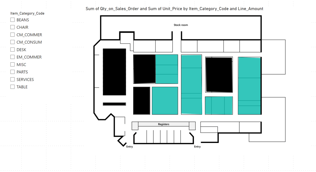
- Obtain a bird’s eye image from your client, detailing layout of store. This could also be created using a wireframing tool or something such as PowerPoint. Keep in mind your BC Connection here. In this example we will be heavily relaying on Item Card details, but this could also be utilized with Bins and Warehousing in Business Central. In the past, I have used this method to evaluate inventory of a greenhouse, where a bird’s eye satellite view was provided and mapped out with different plots being allocated to Bins in Business Central.

Connecting to Business Central:
Here is a brief overview of connecting Business Central to Power BI. However, if you would like to learn more check out my other blog post detailing the process.
Step 1: Get Ready
- Ensure you have access to both Microsoft Dynamics 365 Business Central and Power BI (you only need Pro License if you intend to publish to Service for organizational digestion – else no License needed).
- You should have the necessary permissions to access data in Business Central and to create reports in Power BI.
Step 2: Install Power BI Desktop - Download and install Power BI Desktop from the Microsoft Store or the official Power BI website if you haven’t already.
Step 3: Connect to Business Central from Power BI - Open Power BI Desktop.
- Select ‘Get Data’ from the Home tab.
- Choose ‘Online Services’ and then select ‘Dynamics 365 Business Central’.
- Click ‘Connect’.
Authenticate Your Account: - You’ll need to sign in with your Business Central credentials.
- Choose the authentication method recommended for your organization, typically OAuth2.
Choose Your Environment: - Select the Business Central environment (Production, Sandbox) you wish to connect to.
Select the Company: - Choose the specific company within Business Central from which you want to pull data.
Step 4: Load Your Data - After connecting, you’ll see a list of available tables (entities) from Business Central. Select the tables you need for your analysis.
- Click ‘Load’ to bring the data into Power BI. Depending on the amount of data, this process might take some time.
- Step 5: Getting the Visual
- In the Visualizations Panel, select the three elipses and choose “Get More Visuals”
- Search for the Synoptic Panel Visual. Choose “Add”

Step 6: Detailing your Map
Go to Synoptic Designer for Power BI to create your dynamic map in their online portal.
Upload your image and define your areas. If you would like to practice, they have many templates available for use. In the “Areas” Panel on the right of the designer, make sure to define your unique key as it is spelled in Business Central. This is example I used the Item Category Code.

Export the SVG file and save to your desired location.

Step 7: Power BI x Synoptic Panel
- At this time, go back into Power BI Desktop and load the Synoptic Panel Visual onto your Canvas. You will then want to add in relevant Fields into the appropriate space. In this example, I added my Item Category Code, Line Amount, Qty on Sales Orders, and Unit Price. Obviously depending on requirements, you can add other available fields.


Step 7: Make your Report Dynamic
- From here, feel free to update the aesthetic of your report, adding branding, slicers, and other visuals. This can bring your report to the next level and elevate business insights. Please keep in mind that the visual will only react to other report elements based on availability of data in your dataset.

Resources:
OKVIZ has many amazing tutorials on their website. I highly recommend reading additional documentation if you would like to dive deeper into their products.

Leave a comment